Scrollytelling: transforming complex data into lively stories
Scrollytelling, you read that right, is a neologism made up of the terms ‘scrolling’ and ‘storytelling’.
The rather unemotional definition is: It is a multimedia style of long-form journalism. With the help of merging texts, images, animations and videos, stories are created from data and information. Depending on the generation, readers can immerse themselves in the website on a mostly data-based topic using either the mouse wheel on their computer or their thumb on their smartphone. Through visualisations of complex issues and a common thread, connections are explained and emotions elicited so that a personal connection to the subject is created.
In short: where mere words fail to transmit the spark, scrollytelling jumps in to do the job.

The prerequisite for a good scrollytelling experience is a clever data basis and clarity about which key messages are to be conveyed. Storytelling basics such as the SUCCESs formula naturally also apply to this format. The hook has to be right for readers to really want to dive into the story.
The spectrum of topics covered is almost limitless: from research to social criticism to pop culture, everything can be depicted – as long as there is a message and reliable data. So that you don’t just read about scrollytelling, but immerse yourself in it, here are a few of my favourite examples. They show how versatile this narrative format can be used: to entertain, inform, sensitise and mobilise.
1. Unimaginable wealth
One million, one billion? At first, both just sound like a very large number or quite a lot of money! But how much difference the three zeros actually make is hard to imagine for most people. That’s why normal earners often have no idea what it means to be super-rich. We don’t realise the extent of this. The figures are simply too abstract in relation to the reality of our own lives. That’s why US software developer Matt Korostoff has made them tangible. His website ‘Wealth shown to scale’ shows how absurd wealth is when you have to scroll through it.
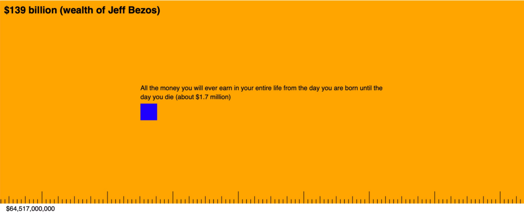
https://mkorostoff.github.io/1-pixel-wealth
2. How bicycle (un)friendly is Berlin?
Under the title ‘radmesser’, the Tagesspiegel has analysed bikes as the choice of transport in the capital. Where does Berlin have good cycle paths? Where are the dangers? And what bothers cyclists the most? Data for the 2018 website was provided by thousands of survey results and hundreds of bike meters from people living in 99 different postcodes. The sensors specially developed for the project recorded data on the distances at which cars overtook the respective bike, for example. Cycle a virtual tour through Berlin and experience the pitfalls and joys of cycling.
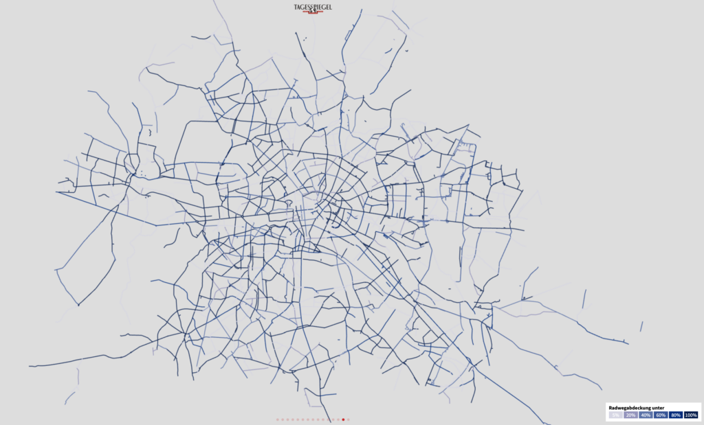
https://interaktiv.tagesspiegel.de/radmesser/index.html
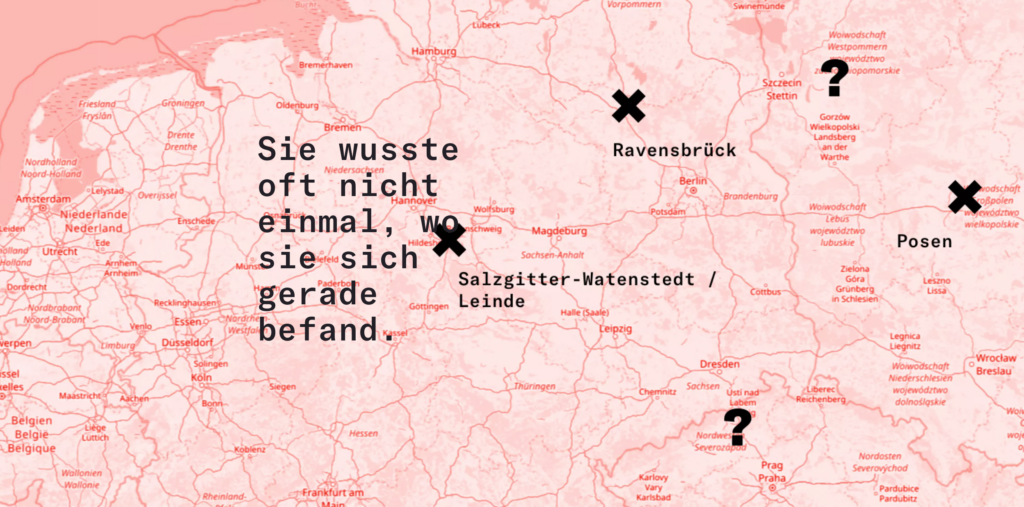
3. “Never again”: Bringing history to life
The #StolenMemory project of the Arolsen Archives – International Centre on Nazi Persecution brings the past back to life. With a more video-heavy approach than the previous examples, the stories of deceased concentration camp prisoners are told. Objects that were taken from them when they were arrested and only returned to the family decades later serve as a hook. #StolenMemory shows the fate of millions of people – based on selected, individual stories. This emphasises their humanity, which was denied them by the Nazis.
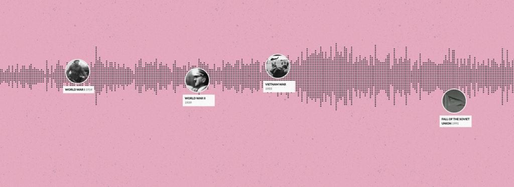
4. The timeline of everything
I would have liked to have had this scrollytelling experience when I was still in school: the designer Matan Stauber has presented all the major events in the history of the earth chronologically in a timeline based on Wikipedia entries. When was which war? In what order were the telephone, the railway and the radio invented? And how have women’s rights developed worldwide over time? Anyone who accepts the initial overload of data quickly understands how the site works and refreshes their general knowledge with intuitive clicks.
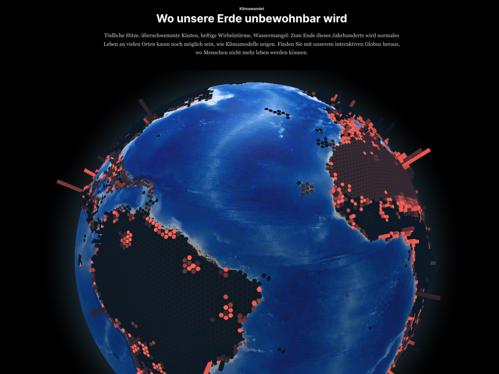
5. Looking into the future: How the climate crisis is changing our world
It’s not just the past that can be brought back to the present with scrollytelling. An outlook into the future is also possible thanks to data modelling. The Berliner Morgenpost has a whole team for experimental presentation formats. With the help of an interactive globe, the journalists show which places climate change will make uninhabitable. With just a few clicks, you can see where it will get significantly hotter, which regions are threatened by water shortages and where in the world it could soon become uninhabitable, forcing people to leave their homes.
https://interaktiv.morgenpost.de/klimawandel-hitze-meeresspiegel-wassermangel-stuerme-unbewohnbar
6. Scrollytelling for brands
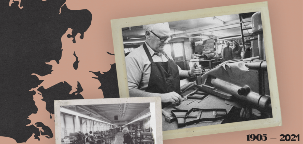
The scrollytelling narrative can also be used by brands to tell their story. The shoe brand Kalsø leads the way and takes interested parties on a journey from 1905 to 2021. They focus on their why, followed by the how. The what, the shoes themselves, initially appear to be of secondary importance. In this way, they create a brand identity that captivates rather than simply selling shoes.
7. Target group analysis: The gen Z way
Not only individual brands can illustrate their story with scrollytelling. Entire industries have the opportunity to make their reports, analyses and findings interactive and appealing. Because, let’s be honest: Who likes reading pages and pages of text and Excel sheets? Exactly. And without an audience, all the work would be wasted. Vogue Business shows how trend analyses can also be fun. They had a close look at Gen Z and its consumer behaviour and prepared the whole thing in a target group-oriented way. With the hook ‘Gen Z broke the marketing funnel’, they arouse curiosity about the mix of data and zeitgeist.

https://www.voguebusiness.com/story/consumers/gen-z-broke-the-marketing-funnel
Conclusion
Scrollytelling has probably become one of my favourite narrative formats after my research. If you want to successfully set up a website in this style, you need clarity. The core messages must be clear and the common thread visible. This is the only way to keep readers hooked. If you can’t make your way through it intuitively, you will leave. Clean data and good preparatory work are therefore crucial. Perhaps that is precisely what fascinates me: Only those who can present a complex topic in a simple way can overcome the curse of knowledge and inspire the masses. There is no room for empty phrases.
When formats are designed interactively, they also give the feeling of being able to help determine the course of the narrative thread. This appeals to the emotions and enables much deeper access to seemingly foreign or abstract content – and thus broadens horizons.

Auf der Suche nach Lösungen begibt sich Optimistin Rebecca in die Tiefen des Internets oder ihrer Gedankenwelt.
Share this article
Related articles


12 November 2024
Successful transmedia storytelling: the right message for the right channel
Read More